To try an extract of the prototype please enlarge to full screen pressing F on your keyboard.
Gilly · Designing a partnered experience
Year: 2021
Product: Mobile App (iOS)
Role: UX/UI and visual designer - Usability testing, Persona development, User flows, User interviews, Wireframes, High fidelity prototype, Brand design, Surveys.
Project summary
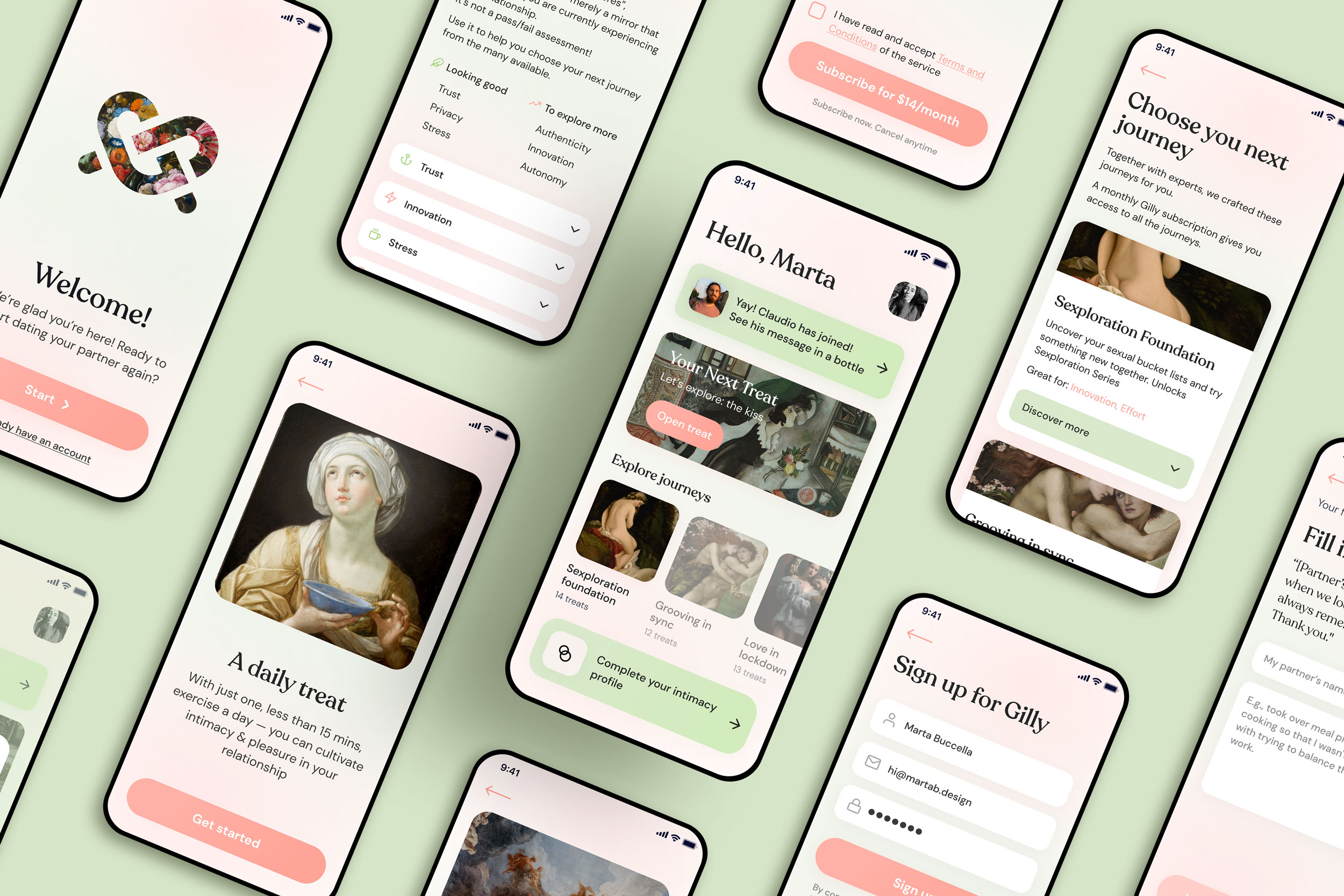
Gilly is an app aimed at couples with children, which helps them cultivate their intimacy making the most out of their available time.
It does so suggesting to both partners some lighthearted (but science-backed) quick exercises, called treats. Treats can be solo or partnered, so each user needs to use the app sometimes individually and other times near the partner.
Team
During the project I cooperated closely with the CEO, Erin, sex counselor and Ted speaker, and the CTO, Marzia.
Erin was taking care of all the content, so we wrote the copy together, combining UX writing with her tone of voice.
Marzia has helped me understand technical constraints, so to prioritize the key features to implement in the first release, which is currently in development.
I also guided the team in creating moodboards, in order to visualize their look and feel benchmarks before making proposals for Gilly’s brand identity.
Challenge
In this case study I will focus on the first bottleneck I encountered in the user flow.
When I started working on the project the product consisted in a Netlify app that had been used to do market research and validation.
The main problem the team asked me to help them solve was that at the end of the onboarding, which consisted of a treat itself, only 11% of the adopters invited their partners to join Gilly. The rest kept using the app solo, and the chances they would invite the partner decreased as time passed.
The Netlify onboarding treat consisted in trying a 6-seconds-long kiss with the partner. Gilly then explained the scientifically proven benefits of it and, in the end, the user was asked to invite their partner sharing the app download link with them.
Testing the app with users, I individuated one prominent pain point: Partner A didn’t invite Partner B because they didn’t feel like trusting Gilly enough at that point.
Breaking this down, user highlighed that they didn’t really got involved during the onboarding: they passively went through the treat, since they weren’t expecting to do something with their partner yet.
Solution
The team and I asked ourselves: how might we create an experience that gives Partner A a taste of Gilly that is enough to make them want to share it, even if we’re limited to a solo treat for now? How might we make them feel less embarrassed? And how might we engage Partner B enough to make them download the app even if they didn’t try Gilly firsthand?
After brainstorming and back, we ideated a new onboarding treat, the “Memory treat”, where the task for the user is to type down a pleasant memory about the significant other, send the link of it, and ask for a reply. Our hope was that of leveraging fun and lightheartedness in order to make users comfortable and take their defenses down. At the same time, we assumed partner B would have felt the invite as personal and would have been curious.
In addition to that, we focused on other two goals in order to make users trust Gilly from the start: to improve credibility through the copy, and to make it easy and appetible for the user to invite the partner later on, adding an invitation screen after each treat.
Results
On the following testing session, the invitation rate went up to 34%. We tested both Partner A and Partner B flow, With 7 users each, and collected their feedback on a Miro board. The feedback demonstrated that there was still room for improvement - for example, users needed more reassurance about privacy now, as they were writing down something personal. They also asked for having the possibility to send the message later, at a time when it would have been ok for the partner to read it. Since a notification reminder would have been tecnically challenging, in the following iteration we added a discreet banner on the homepage reminding users to invite the partner at any time.
Takeaways
The work done in this part of the flow has been, first of all, useful for me to get better at putting myself into the shoes of a target I’m not part of.
Most importantly, I have been it has been challenging and rewarding to create an experience that is digital, yet not individual.